Last week, I wrote about the worst logos for the best courses, and that’s always fun. It’s easy to poke fun, right? But let’s try and turn to the positive and talk about the BEST logos, again using the Top 100 list. (The number next to each golf course is their ranking as of the latest publication.)
A good golf course logo is one that is distinctive, not garish and hopefully stands on its own without the name of the golf course. And, because SO many other golf courses have a similar one, a simple tree or a crest almost always isn’t going to do it.
Pinehurst (6)
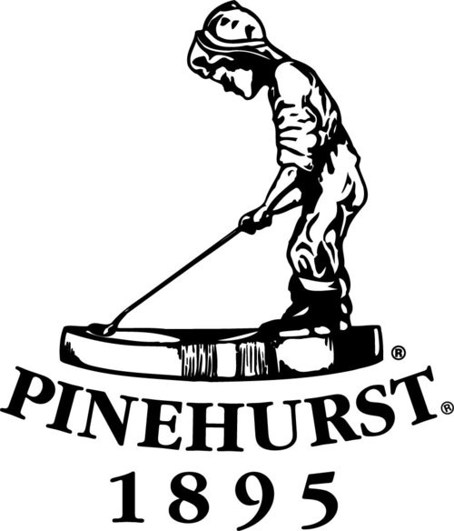
Look, “Putter Boy” does, in fact, look maybe like a little boy taking a wee. But it’s also so iconic that even though the below logo does in fact have the course name below it, it’s not needed. Even though the No. 2 course is the one on the list, the logo is really for the resort, so the fact that this covers eight courses, plus The Cradle, gives extra points. (Yes, each course technically has its own logo for merchandise opportunities, but the below is the Pinehurst logo.)
Old Macdonald (12)
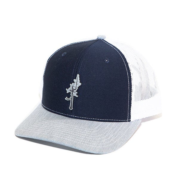
First, all the caveats. The most important is that this is a secondary logo, you won’t find it on the scorecard or the site specific to the golf course. The second is that this is, yes, a tree. But … we’re talking about The Ghost Tree. It’s so iconic, I don’t know WHY it’s not the course logo - but it’s sold on gear, folks who have played it and I adore Old Macdonald, so I’m making an executive decision and allowing it.
Pasatiempo Golf Club (17)
I think this is sort of controversial, and there IS undoubtedly something weird about a bunch of (generally speaking) older white men playing a course with a logo of a sleeping Hispanic man (or at least, someone wearing a sombrero). But … allow me a retort. The word “pasatiempo” means “hobby” or “activity done in spare time for enjoyment” which is an EXCELLENT name for a golf course. And a guy sleeping under a palm tree is nice and soothing. And I don’t know, it just makes me feel happy. It’s totally unique, and if it’s truly objectionable, I guess feel free to cancel me.
Harbour Town Links (25)
I can’t tell how much the course simply embraces this logo because their website is almost purposefully difficult - but, it’s also the logo of the entire Sea Pines resort (which has two other courses), and it’s instantly recognizable. Even casual golf fans will understand it’s part of “that” golf course even if they might not know which course it is. It’s iconic, and that’s what we’re looking for here. (I couldn’t find an official logo without the name of the course, but I’m just assuming they are smart enough to slap this bad boy on a hat on its own.)
Mammoth Dunes (29)
Mammoth Dunes is part of Sand Valley Resort, and I am currently scheduled to visit and play in late September of this year. I can’t wait, and it’s not JUST because the logo here is so good I had to show two versions of it below, it’s because the course is supposed to be wildly, impossibly fun. And how good are these logos? Totally unique, fun and the kind of thing that makes me think I should start saving now for the damage I’m likely to do in the Pro Shop.
Gamble Sands (38)
Another exception to the rule, because this logo not only includes the course name, it sort of IS the course name … and also, a bunny! Gamble Sands is WAY high up on my list, but I have yet to play it. A David McLay-Kidd course, it’s just not near anything else so I need to prioritize a trip just to play Gamble Sands. I think it will be worth it. And I just don’t know…the logo just makes me smile. I’ve never seen another like it, and that’s good enough for me.
Tobacco Road (49)
I can’t lie, I dig this one a LOT. It’s not just because it’s one of the few golf course logos that dares to be maybe just a wee bit scary, it’s because I don’t know WHY there’s a skull involved at all. The tobacco leaves, sure. But why is the main course logo that of a dead cow? Who could possibly say? The course itself is truly odd, and does its own thing, and that’s absolutely reflected in the course logo.
Some also-rans:
The Links at Spanish Bay — I love the bagpipe player, and it’s even more meaningful if you’ve been there and seen and heard the actual bagpipe player doing his thing at sunset. It also would have felt nice to balance this out against Spyglass Hill which made the (cough) other list. But it’s really NOT the course logo as much as the Inn, and I couldn’t pull the trigger.
The Loop - A reversible set of courses, the Red and Black, the logo for these courses is the infinity symbol with strands of red and black throughout. That’s dope!
Mossy Oak. It’s a tree and a golf pin, so that’s not ideal - but one side of the tree is shady, which I assume is the moss and it’s simple and kind of … charming? It’s in Mississippi (and yes, I had to do the M-i-ss-i-ss-i-pp-i to ensure I spelled it right), so I can’t imagine when if ever I’ll be there, but hey, nice logo!
So that’s my list. What did I miss? What would be on your top logos in golf?







Also trying to identify a logo that has 2 red coats in it. Would appreciate any help
Hi, where is the full list? Thanks