In the middle of a golf chat, for reasons I’m not entirely sure of, someone posted the Maryland state flag - and chaos ensued. Some folks (most, but not all, who have lived in the Maryland area) said it was great. Many others, including yours truly, think it’s anything but.
I’ll admit, I’m not sure I’ve ever seen this flag before. And if you’re like me, your first impression might be that someone took too much peyote in 1971 and came up with this:
It turns out this has been the Maryland state flag since 1904! (Guess there was a lot of peyote going around in 1904.)
But because I am me, this led to me looking at ALL the state flags, and let’s get out ahead of this, I’m relying almost exclusively on Wikipedia, and specifically this page on state flags. My overall impression is that there is just so much work we need to do. So many of these look virtually identical to each other. Where’s the fun in that?
So, let’s rank them, worst to first. We’re using Tiers, instead of trying to decide what the 47th best flag is vs the 46th, mostly because I don’t have that kind of energy to devote to this.
But First, A Word from our Not States
In an effort not to ignore places like the District of Columbia, Puerto Rico and others let’s rank all the district/territories:
The bottom three:
The Mariana Islands and Guam are just somewhat boring, though Guam has a small tropical vibe which I adamantly support. The Virgin Islands look like a subsidiary of the Defense Department.
But these? These are fan-fucking-tastic. Puerto Rico has the most distinctive use of the red, white and blue of the many other attempts you’ll soon see. American Samoa has a screaming bald eagle holding a war club and a fly whisk. How this didn’t end up on the cover of a metal album is beyond me. And the District of Columbia is incredible and hails back to George Washington’s family coat of arms.
Onto the states.
F Tier: The Bottom of the Barrel
There is a unifying principle to the following flags, and it is this - who can possibly tell what state any of these are for? (Aside from some violating yet another rule, and one that my home state violates - don’t print the name of your state on your flag. In fact, try not to print any words. Logos should rule all. This is how I choose what hats to buy at a golf course, seems like it’s extensible even moreso to a state flag.)
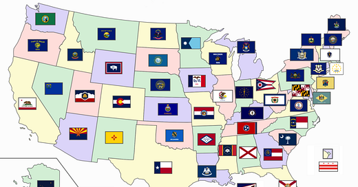
This is flat out embarassing for everyone involved. Some of these look so similar I feel like they were designed by the same person. In case you, like me, were unaware, these are the flags (in order from right to left, top to bottom): Pennsylvania, Connecticut, New Hampshire, Virginia, New York, Vermont, Kentucky, Maine, Michigan, Wisconsin, Kansas, Nebraska, North Dakota, Montana and Idaho.
D Tier: Real bad, but at least they (sort of) tried to be a bit unique
Oregon gets a pass SOLELY because they have an image on the back of the flag - and it’s a cute little beaver! Delaware, New Jersey, Massachusetts, Illinois, West Virginia, South Dakota and Washington get upgraded from F Tier almost solely for using a different colored flag than navy blue. Louisiana has a bleeding pelican which is so metal I almost moved it up even higher. Nevada decided to put their boring ass crest in the upper left, so they at least differentiate from everyone in F Tier, but let’s do better folks.
C Tier: You had a chance to do good. You failed.
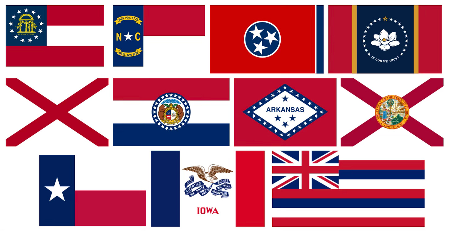
Deep breaths. OK, many of these states amended their flags recently because their old versions just MIGHT have had a wee touch of Confederacy in them. Others, like Tennessee (third on the top) have been like this forever. They’re all … fine. But very few are distinctive. Alabama and Florida, which flank the middle row, are laughably similar and I’ve gotten confused which is which three separate times while doing this. Lastly, Hawaii (the last one, which has a goddamn UNION JACK on it) - what are we DOING? Where’s the sunset, the palm tree, the glory that is the most beautiful state in the country? Why do you like like a territory of the United Kingdom? Quite frankly, this should be even lower in the rankings. (I understand that this is a nod to the good relations between Britain and the Kingdom of Hawaii, and that this has been the flag since before Hawaii was a state. But you know there are QUITE a few US states that used to be part of the United Kingdom, and … yeah, I can’t get with this.I’m not sure I love this alternate flag that some - but not all - say was the original flag of Hawaii, but I know I like it more than the actual one.
B Tier: Good job by you! But not a great job.
Here we have Maryland, Ohio, Indiana, Wyoming and Utah. In all ways, these states are doing their own thing - and they all get points for that. I just don’t LOVE what any are doing. Wyoming is CLOSE with the buffalo, and Ohio earns points for simply having its own shape (otherwise, it would be firmly in the prior tier). Maryland looks like a failed art school project, and Indiana just somehow evades being in the most bottom tier because it’s fairly cool what they are doing - but it’s still, at the end of the day, a navy blue flag with a crest.
A Tier: So close. So, so close.
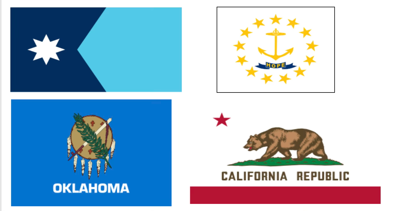
Look, this hurts. I absolutely wanted to put my home state of California in the S Tier, but writing CALIFORNIA REPUBLIC is disqualifying. Remove that and it might just be the best flag in the country. The same could be true for Oklahoma, which features a WAR SHIELD, eagle feathers, etc. In fact, they had a prior version without the state name - but added it to “combat widespread illiteracy.” It is noted in Wikipedia that there is no evidence this helped. Take it away! Look how much better this is:
Minnesota is just cool - two colors, the eight pointed star, good stuff. And Rhode Island is really simple, has a nice message that IS NOT the name of the state and is distinctive. Good job.
S Tier: The Cream Of The Crop.
No notes. South Carolina features a crescent moon and a Palmetto tree. Colorado is just so simple and cool. New Mexico is a yellow flag with, with the red accents are a nod to Spain and a symbol from the indigenous people in the state. Arizona is modern and genuinely kind of dramatic, and Alaska features the goddamn BIG DIPPER. These are all truly fantastic state flags. Take a bow.


As a proud Coloradoan, you are welcome (and agree.). Solid assessments.
what did I just read?