The Worst Top 100 Golf Logos
Make-A-List Monday goes where (perhaps) no one else has gone before
Golf course logos are weird. Certainly, in the grand scheme of things it doesn’t matter much what the logo is, and most of them are relatively forgettable crests or trees, etc. But for top courses, you want something cool and memorable. I am a big fan of buying a hat with JUST the logo, not the name of the course. If you know, you know. So it genuinely kind of stinks when you play a truly great course and … it’s a world-class bad logo.
Here then, are the worst logos in the top 100 golf courses - note, I’m using the public list here mostly because that’s what I have available, but also because I really don’t know what most toney, private courses logos are.
Pacific Dunes (Bandon Dunes), Bandon, OR. It’s a small secret that none of the logos at Bandon Dunes are world-class, but somehow the top-rated course there has the absolute worst logo of all of them. Look at this:
Seriously, what IS that? I think it’s two seals posed next to each other. I don’t know why. I’ve never seen a seal anywhere near the property. For a course that is currently ranked as the 2nd best golf course you can play, it’s a travesty.
Shadow Creek, Las Vegas. This Tom Fazio designed course was private for awhile, but is now playable by anyone willing to spend an obscene amount of money. And with a name like Shadow Creek, the possibilities are pretty cool for a logo. Instead they came up with … this:
That literally looks like someone “designed” it by switching fonts on Microsoft Word until they got to “fuck it, this works” and … that’s it. This is currently the 5th highest ranked course, and aside from being an environmental nightmare looks like a nice course to play. But, honestly they could spend a bit more time on the logo. Not a great effort here, folks.
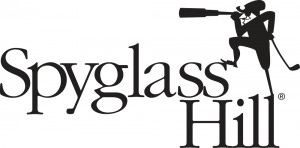
Spyglass Hill, Monterey, CA. I played this at the end of 2020, and honestly it’s a magical place. Such a good test of golf and some of the most memorable holes (the 4th sticks with me as much as any hole in golf). It’s the 10th highest ranked golf course on this list, and … this is what you end up buying if you want a hat or pin flag after your round:
That’s a little dude, with a long telescope or something…see, he’s spying! And I know this logo goes back years, but honestly it looks like it was drawn by an eight year old. This is as good as we can do? There’s an alternate logo that is mostly a map of the Monterey Bay area and that’s decent, but this really feels like a tragedy. Do better.
Chambers Bay, University Place, WA. This (like Pacific Dunes and Spyglass) hurts my heart. I love this course, and it was one of the most fun rounds I played in 2021. I sprinted into the Pro Shop after the round, excited to do some real damage and was presented with this:
That’s just so, so bad. First of all, I want a logo that exists without the course name and in fairness, that does exist but it’s just two…sails? Crescent moons? I don’t know. On a hat, it looks like something is missing. On a ball marker, it looks broken. Again, we can do better.
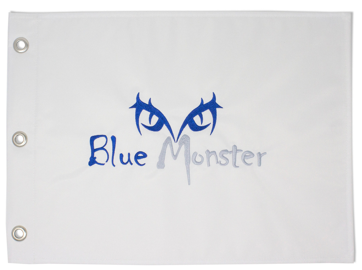
Trump National (Doral), FL. OK, we’re down at the 87th ranked course, and this might be a personal thing here, I acknowledge it. And admittedly, there’s an alternate logo here that is …and I truly hate to say this .. excellent. The course is known for the “Blue Monster” - the 18th hole, named for the water hazard that can torpedo a round. The logo?
Look, politics aside that is SICK. That’s absolutely something I’d want. But the actual logo is - well, it’s exactly what you think it is:
I had to go to the “trumpstore.com” store to find out exactly what the logo for the course was and my god…that site is ammonia for the eyes. If you’d made a satirical website about someone who was absolutely infatuated with himself, and wanted his name to be the predominant factor in every piece of merchandise, you wouldn’t even come close to this. And yet, a troubling amount of this stuff is sold out.
Donald Trump is one of - perhaps the - worst human beings on earth. It’s annoying that he’s inextricably linked to golf, and it does still bother me how much I adored Turnberry and putting money into his family’s pockets. But this? This is a genuinely bad logo, regardless of politics. I can barely tell that it is the course crest with some ribbons, and then the course name in what appears to be Times New Roman script. (In fairness, I think his name is actually less predominant here than in many of his other courses.) I assumed more top 100 courses would have this kind of logo but honestly they don’t. Most of them try a bit harder.
So that’s my list. What did I miss? Leave your worst logos in the comments below.


